

Imagine your investment portfolio as a vast ocean, brimming with possibilities. But navigating this dynamic landscape requires a trusty map – and in our financial voyage, that map is none other than the stock chart, guiding you through hidden currents, uncharted territories, and tales of buried treasure in the market. How to Read a Stock Chart becomes your compass on this thrilling journey.
What is a stock chart?
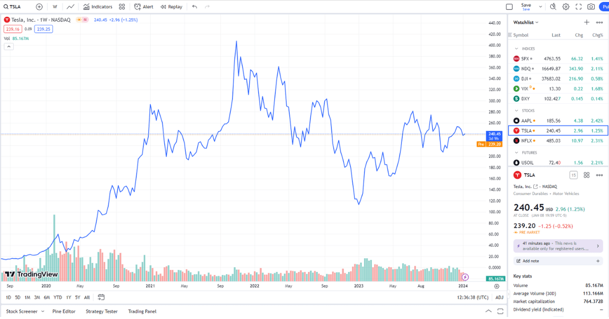
So, what exactly is this cryptic scribble of lines and bars? A stock chart is your window into the soul of a company. It’s a visual chronicle of its price journey, capturing every surge of excitement, every tremor of doubt, every whisper of the market’s fickle winds. It’s a dance of supply and demand, a tapestry woven with the hopes and fears of millions.
watch video: how to read a stock chart:
Why is it important to be able to read a stock chart?
Now, why is deciphering this tapestry so crucial? Imagine an explorer blindfolded in uncharted waters. Every decision feels like a gamble, every turn carries the threat of hidden reefs. But with the chart as your compass, you navigate with confidence. You see the rising tides of momentum, the treacherous shoals of resistance, and the calm coves of support. You anticipate the market’s whispers and predict its roars. You become a seasoned captain, reading the currents, exploiting the eddies, and ultimately steering your portfolio toward prosperity.
What are the different types of stock charts?
But wait, before you embark on this grand financial adventure, you must choose your trusty vessel. For charts, like ships, come in different shapes and sizes. There are line charts, sleek and simple, tracing the price’s elegant dance through time. Bar charts, sturdy and steadfast, stand witness to each day’s trading volume, whispering secrets of investor sentiment. And then there are the candlestick charts, flamboyant and expressive, their bodies and wicks ablaze with tales of bullish victories and bearish retreats.
These are just the first whispers of the language of charts. In the coming sections, we’ll peel back the layers, delve into their intricacies, and equip you with the tools to unlock their secrets. You’ll learn to identify trends, spot patterns, and interpret the market’s cryptic signals. With each stroke of knowledge, your chart will transform from a bewildering labyrinth to a treasure map, guiding you on your journey to investment mastery.
Basics of Stock Charts
Price
The price of a stock is the most important piece of information on a stock chart. It represents the current value of a single share of stock. The price is typically displayed on the y-axis of a chart, with the highest prices at the top and the lowest prices at the bottom.
There are two main types of price data that are displayed on stock charts:
- Closing price: The closing price is the price of a stock at the end of the trading day. It is the most commonly used price data for technical analysis.
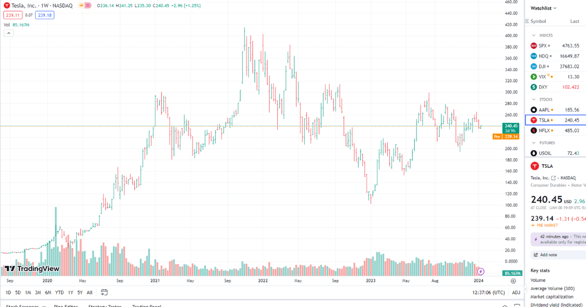
- Open, high, low, and close (OHLC): The OHLC data displays the price of a stock at the open, high, low, and close of the trading day. This data can be useful for identifying trends and patterns.
Volume
Volume represents the number of shares of a stock that have been traded during a given period of time. It is typically displayed on the x-axis of a chart, with the most recent data at the right.
Volume is an important indicator of investor sentiment. High volume typically indicates that there is a lot of interest in a stock, while low volume indicates that there is little interest.
Time
The time scale of a stock chart determines the length of time that is displayed. Time scales can range from minutes to years.
The time scale of a chart can be important for identifying trends and patterns. For example, a short-term time scale might be used to identify intraday trends, while a long-term time scale might be used to identify long-term trends.
Types of Stock Charts
Line Charts: Simplicity Speaks Volumes
Imagine a minimalist masterpiece, a single, flowing line gracefully traversing the canvas of time. This is the realm of line charts, where elegance meets clarity. The price, the protagonist of our story, dances across the y-axis, connecting closing points like pearls on a string. Line charts excel at showcasing long-term trends, highlighting major support and resistance levels, and offering a panoramic view of market sentiment. They’re ideal for the novice and seasoned investor alike, offering a clear and concise overview of a stock’s historical journey.
Bar Charts: Standing Tall with Details
Yearning for deeper insight? Enter the domain of bar charts, where each trading period stands resolute like a sentinel on the chart. Each bar tells a mini-saga: its height, stretching from open to closing price, captures the day’s price range, while the thin line across the middle whispers the high and low points. But the true secret lies in the bar’s width, the “volume.” A thick bar speaks of a boisterous trading session, with buyers and sellers clashing in a flurry of activity. A slender bar, on the other hand, hints at a quieter day, a lull in the market’s dance. So, line charts might tell the “what” of price movement, but bar charts delve into the “how,” unveiling the pulse of investor sentiment along the way.
Candlestick Charts: Masters of Expressive Storytelling
Ready to graduate with a master’s in visual storytelling? Candlestick charts await you, flamboyant artists who paint with not just lines, but with vibrant colors and expressive body language. The “candle,” a hollow rectangle, stands proud between the open and closed prices. Its color, green for a rising market and red for a falling one, instantly sets the scene for the day’s sentiment. But the drama doesn’t end there! Above and below the candle, delicate “wicks” stretch out, capturing the highest and lowest prices traded. A long upper wick paints a picture of a failed attempt to push the price higher, while a long lower wick whispers of a thwarted bearish attack. Candlestick charts, with their vivid hues and expressive wicks, become your window into the emotional rollercoaster of the market, revealing not just price movement, but the underlying forces of supply and demand in their raw, dynamic state.
Reading Stock Charts
Identifying Trends
A trend is a general direction in which a stock’s price is moving. There are two main types of trends:
- Uptrend: A stock is in an uptrend when its price is generally rising.
- Downtrend: A stock is in a downtrend when its price is generally falling.
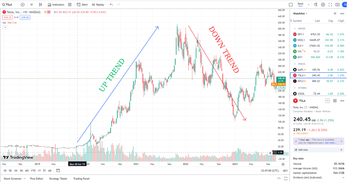
There are several ways to identify trends on a stock chart. One common method is to look for a series of consecutive higher highs and higher lows. This indicates that the stock is in an uptrend. Conversely, a series of consecutive lower highs and lower lows indicates that the stock is in a downtrend.
Another method for identifying trends is to use trendlines. A trendline is a line that connects two or more points on a chart. Trendlines can be used to identify the direction of a trend and to predict where the trend may end.
Identifying Support and Resistance Levels
Support and resistance levels are important technical indicators that can help you identify potential entry and exit points for your trades.
- Support: A support level is a price level where buyers are likely to step in and prevent the price from falling further.
- Resistance: A resistance level is a price level where sellers are likely to step in and prevent the price from rising further.
Support and resistance levels are typically formed at areas of high volume or at psychological levels, such as round numbers.
Identifying Patterns
Patterns are repeated price formations that can indicate future price movement. There are many different types of patterns, each with its own unique significance.
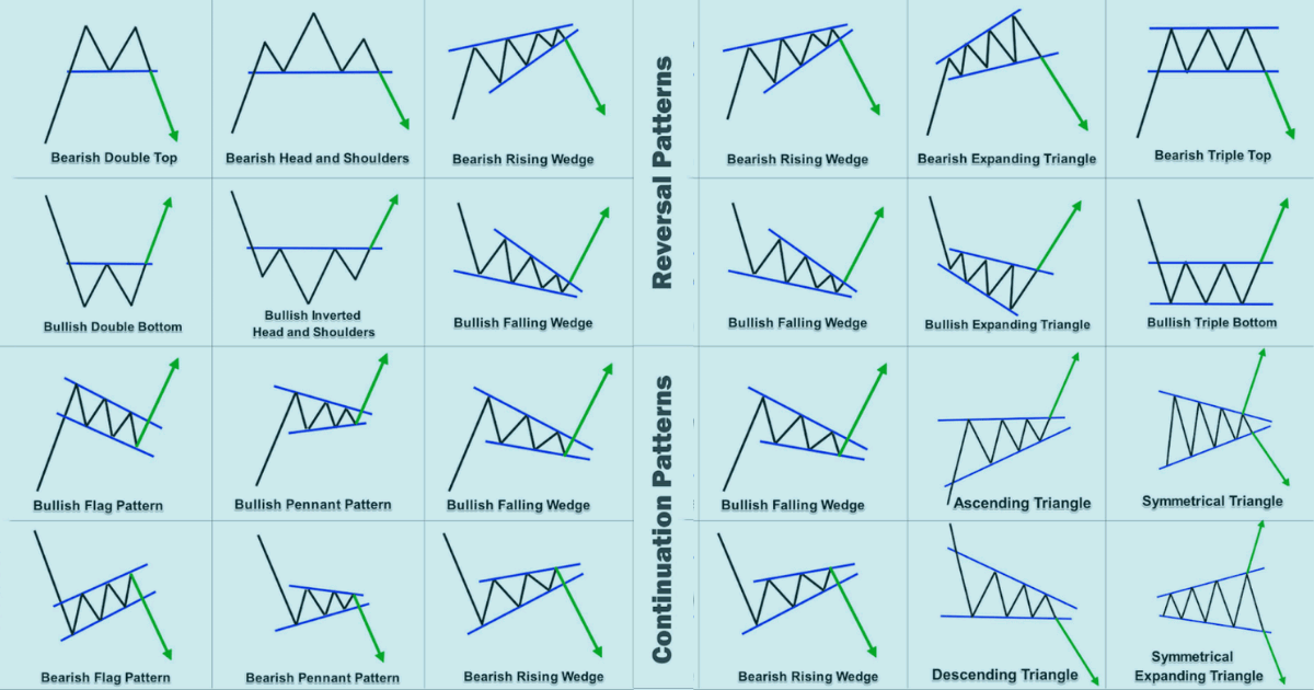
- Head and shoulders: This pattern is a bearish reversal pattern that consists of three peaks, with the middle peak being the highest.
- Double top: This pattern is a bearish reversal pattern that consists of two peaks that are close in price.
- Double bottom: This pattern is a bullish reversal pattern that consists of two bottoms that are close in price.
- Cup and handle: This pattern is a bullish continuation pattern that consists of a rounded bottom formation with a handle.
- Triangle: This pattern can be either bullish or bearish, depending on the direction of the trend that precedes it.
Learning to identify patterns takes time and practice. However, with a little effort, you can learn to use patterns to improve your trading results.
Charting Your Course to Investment Success
We’ve embarked on a thrilling journey through the world of stock charts, deciphering their cryptic language and unlocking their secrets. Now, as we stand at the summit, let’s recap the key treasures we’ve unearthed:
Key Takeaways:
- A stock chart is your window into a company’s soul, charting its price journey and whispering tales of the market’s whims.
- Price, volume, and time are the fundamental pillars of a chart, forming the foundation for analysis.
- Line charts offer a minimalist panorama, ideal for spotting long-term trends and major support/resistance levels.
- Bar charts delve deeper, revealing volume alongside price movement, and painting a picture of investor sentiment.
- Candlestick charts become masters of visual storytelling, wielding color and wicks to depict the emotional rollercoaster of supply and demand.
- Identifying trends, support/resistance levels, and patterns empowers you to anticipate the market’s dance and make informed investment decisions.
Charting Your Future:
Remember, your investment journey is a continuous exploration. To further hone your chart-reading skills, consider these valuable resources:
- Investopedia: A treasure trove of financial knowledge, offering comprehensive articles and tutorials on technical analysis and chart reading.
- StockCharts.com: An advanced platform with powerful charting tools, educational resources, and real-time market data.
- TradingView: A popular interactive platform for charting and technical analysis, featuring a vibrant community of traders and investors.
- Books: “Technical Analysis of the Financial Markets” by John Murphy and “Trading in the Zone” by Mark Douglas are classics for aspiring technical analysts.
Remember, practice makes perfect. Apply your newfound knowledge to analyze real-world charts, experiment with different techniques, and don’t be afraid to consult resources and experts along the way. As you navigate the dynamic currents of the market, your charts will transform from static images to trusted guides, propelling you toward informed investment decisions and ultimately, financial success.
So, set sail, adventurer! The market awaits, and your charts are your compass.


